Statements
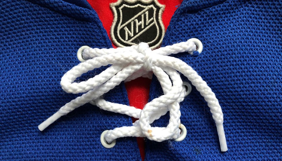
The Utah Hockey Club has officially revealed its color scheme, logo, and jerseys for its highly anticipated inaugural season in 2024-25.
After relocating from Arizona, the Utah team is integrating primary and secondary colors that pay homage to the unique landscape of the region.
The team will debut under the Utah Hockey Club moniker for its inaugural season while it works towards a more permanent rebrand set for the 2025-26 season and beyond.
While awaiting the future name and logo, Utah has disclosed the color scheme and uniform designs it will utilize in the meantime.
New Color Scheme
Utah has chosen "rock black," "salt white," and "mountain blue" as part of its color palette.
These colors are thoughtfully selected to resonate with Utah’s natural beauty and rugged terrain, reflecting the state's essence.
The club is keeping the logos minimalistic, employing the "Utah Hockey Club" text in various forms, including some featuring the state of Utah’s outline.
These color choices will remain consistent even after the team's new name is finalized, a decision currently being driven by a fan vote.
Jersey Designs
The home jerseys feature black as the primary color with "UTAH" spelled out diagonally across the front.
The away jerseys maintain the same design but opt for white as the primary color.
This diagonal text format is a classic design within the league, most famously utilized by the New York Rangers.
Other teams, such as the Carolina Hurricanes, Pittsburgh Penguins, and Vegas Golden Knights, have also employed this design in their recent alternate uniforms.
The simplicity and traditional feel of the uniforms provide a sense of established history as the team gears up for its permanent identity.
Upcoming Rebrand
The Utah Hockey Club is set to finalize its permanent rebrand soon, with fan voting for the new team name closing on June 20.
The finalists in the naming contest include Blizzard, Mammoth, Outlaws, Venom, and Yeti, along with the option to retain the Utah Hockey Club name.
This community-driven approach to rebranding underscores the organization’s commitment to building a strong, local fan base from the very beginning.
Quotes
"The new team colors—'rock black,' 'salt white,' and 'mountain blue'—perfectly encapsulate the spirit of Utah's rugged landscape," a team representative stated.
"While the interim name 'Utah Hockey Club' and the simple 'UTAH' diagonal text on the jerseys keep things straightforward and rooted in tradition, these elements provide a solid foundation for the team's future identity," they added.
"Utah is eagerly anticipating the conclusion of the fan vote and looks forward to unveiling its new permanent brand, which will undoubtedly evoke the passion and spirit of the community," the team spokesperson continued.
"As the team prepares for its debut season and the unveiling of its permanent identity, there is a palpable sense of excitement among fans and players alike."
"The future looks bright for the Utah Hockey Club, and the months leading up to the new season will be filled with anticipation as this new chapter in the team’s history unfolds." The representative also highlighted, "The unveiled design and color schemes not only set the stage for what is expected in the future but also create a sense of belonging and pride among fans and players."
He concluded, "This transitional period plays a crucial role in the team’s development and community integration, providing a template for what is yet to come."
With the debut season on the horizon, the Utah Hockey Club is keen on establishing its presence both on and off the ice. The interim branding efforts, featuring distinctly local color palettes and classic design elements, set a promising stage for what lies ahead. As the fan-driven rebrand process nears its end, anticipation and excitement are mounting, promising a bright future for the new club.